Understanding how buses move through New York City is a data problem as much as it is a transportation problem. Every route has its own geography and operating patterns, each stop a unique context, and each street segment faces fluctuating traffic, pedestrian activity, construction, and other operational conditions. Over time, the spatial structure of the bus network, including its routes, stops, and surrounding traffic patterns, shapes the daily experience of millions of riders.
To help analysts, researchers, and everyday New Yorkers make sense of this complexity, the MTA continues to expand its geospatial open data offerings. This post highlights two new datasets, MTA Bus Stops and MTA Bus Routes, to show how they can be combined with existing dataset such as Bus Route Segment Speeds to visualize route-level and segment-level speeds for a recent month.
The two new geospatial datasets: MTA Bus Stops and MTA Bus Routes
The newly released datasets provide a consistent, structured, and spatial representation of every stop and every route shape in the bus network. They come from the same authoritative internal data sources that power NYCT planning, customer information systems, and mapping tools, and are now available to the public with clean geometry and clear metadata.
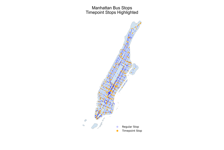
MTA Bus Stops dataset
The Bus Stops dataset contains detailed information on all MTA bus stops, with each stop represented as a geographic point. It also includes several additional useful attributes.
Some highlights:
- Stop identifiers and names, allowing stops to be referenced consistently across datasets
- Route identifiers, linking each stop to one or more routes
- Direction of travel, cardinal directions (N, S, E, W).
- Timepoint flags, identifying stops used for scheduling and adherence
- iscbd, a boolean field indicating whether a stop is in the Congestion Relief Zone
- In_effect, flag for the currently active shapes dataset
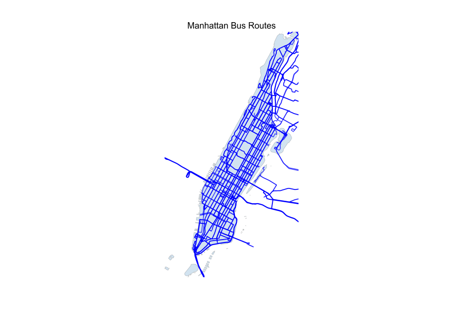
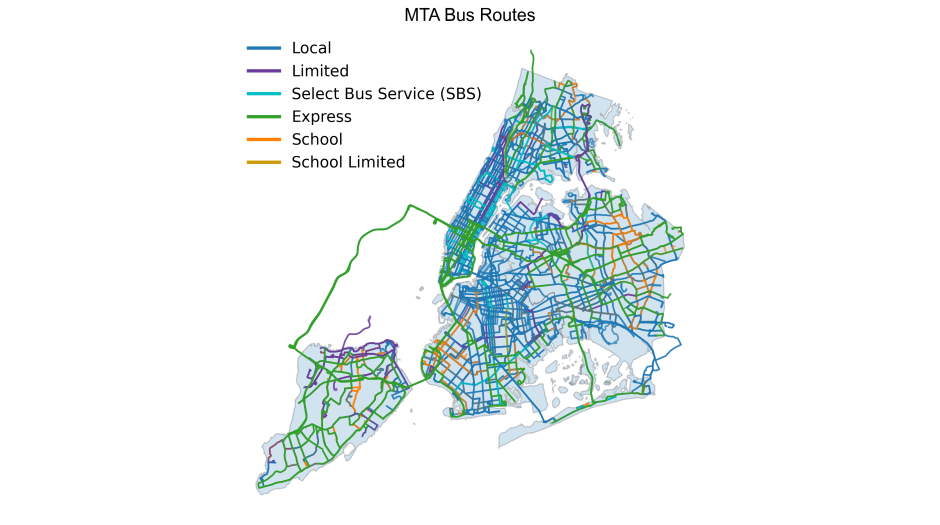
MTA Bus Routes dataset
The Bus Routes dataset provides polyline geometries that represent the actual paths buses take along the street network.
Key fields include:
- shape_id: Unique identifier for each route shape
- route_type: Service classification for the route (Local, SBS, Limited, Express, School)
- direction_id: Direction of travel
- geometry: Full polyline geometry (in Well-Known Text format), representing the precise street-level path of the route
How these datasets enable route and segment-level analysis
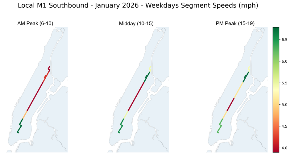
Segment-level speed data allows analysts to examine how bus performance varies between consecutive stops and across different operating conditions.
Together with the MTA Bus Stops and MTA Bus Routes datasets, these enable analysts to visualize average speeds along bus routes.
Methodology: Combining bus speeds, stops, route shapes, and Python
Segment-level analysis requires combining and spatially aligning several datasets. While the Bus Stops and Bus Routes datasets describe where buses operate, the Bus Route Segment Speeds dataset describes how quickly they are moving.
The dataset provides observed average speeds and travel times between consecutive timepoint stops, aggregated by month, day of week, hour of day, route type, and direction. Because timepoints are used for scheduling, they provide a consistent way to measure performance along a route. Read more about what is included in this dataset and how it is constructed.
However, this dataset is purely tabular. Although it includes latitude and longitude for the start and end timepoints, it does not contain line geometries representing the actual street segment traveled by buses. To visualize speeds spatially, those geometries must be constructed.
To better reflect the actual path, stops are projected onto their route shapes from the Bus Routes dataset. Segment geometry is then derived along the route alignment between the two points, producing segments that follow the route shape rather than a straight-line approximation.
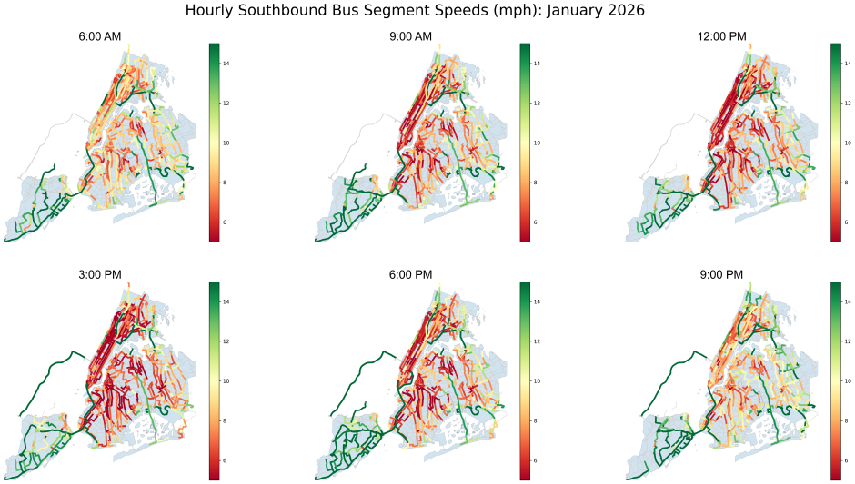
This visualization focuses on a single Manhattan route, the M1, showing segment-level speeds along each timepoint-to-timepoint segment.
Rather than looking at systemwide averages, the map shows observed speeds along each segment, colored according to the average road speed for all weekdays within a selected month and time period. Faster segments appear in greener tones, while slower segments appear in red.
Segment-level visualization reveals where buses move efficiently and where speeds decline, rather than treating the route as a single average.
The map below highlights average weekday segment speeds along the M1 during the selected time periods.
Try it yourself
All datasets used in this post are available on the NYS and NYC Open Data portals:
Conclusion
Transit systems are inherently spatial. By publishing standardized geospatial datasets for bus stops and routes, the MTA is making it easier to link operational data with the physical street network.
This post aimed to introduce the datasets and demonstrated one approach to visualizing segment-level speeds. We hope it inspires further exploration, whether through new visualizations, deeper performance analyses, or entirely new questions about how buses move through the city.
If you are interested in a more hands-on demo of how to work with the datasets featured in this post, we hope you’ll join for a live, virtual demo on Tuesday March 24, 2026. Learn more about the session and how to register.
About the authors
Emmalie Morisseau and Benjamin Tannenwald are members of the MTA Data and Analytics Team.