This is Part 3 of a multi-part blog series. Read Part 1 and Part 2.
Welcome the third and final blog post in our series exploring the MTA’s Capital Program Dashboard. This one is particularly exciting because, if you’re reading this, that also means we’ve officially launched the beta version of the new Dashboard. You can find it at capitaldashboard.mta.info.
This dashboard is being shared in beta while we continue to refine some of the features and functionality. This also means that the data you see on the dashboard is not exhaustive and only represents a subset of projects. We’ll get into some of the new features and our development roadmap a bit more below, but first we want to explain some of what you’ll see on launch.
Data
To support this new dashboard, we are releasing a bunch of new project-level data pulled from a variety of different sources (like added procurement details) into a new consolidated data schema. We will be coding all our 2025-2029 projects into this new schema natively, but it will take us a little time to go back and re-code our older projects. To give users a better sense of how the Dashboard will look when it is completed, we’re including the following projects to start:
- All active ADA projects
- Projects in our current procurement pipeline
- Candidate locations for projects in the 2025-2029 Capital Plan*
* While we’ve included these locations on the map to show the broad scope of our new Capital Plan, these locations haven’t yet been broken up into “Projects” quite yet, since we’ve just gotten started. As we discussed in our last blog post, we might decide to bundle them differently or group locations across asset types together. We’re hard at work organizing these locations into efficient project scopes.
Notice any bugs? Have ideas for improvements? Share your feedback with us. Once we’ve heard from our users, we will finalize the data schema and begin re-coding our past projects. The datasets that power this Dashboard will also be available on the New York State Open Data Portal with further documentation. In the meantime, the classic version of the Dashboard will continue to live on.
Now, on to some of the new features.
The Map and Transit Services
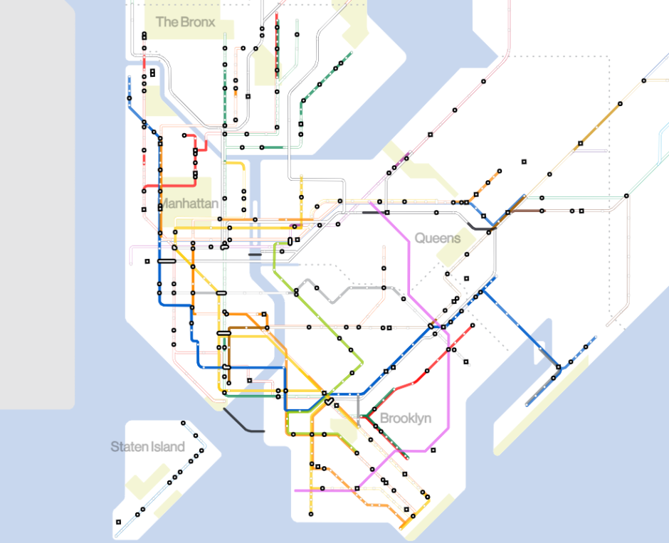
If you’ve been around the subway system recently, you might have noticed that we’ve recently introduced a new subway map. Unlike the previous more-geographic subway map, our new map utilizes a diagrammatic style—employing bold, straight lines that emphasize clarity and the relative relationships between transit services rather than their exact street-level placement. This design is much easier for the eye to follow and makes the system easier to understand at a glance.
We thought those attributes might be useful for us on the construction side, too. By using this mapping style, our projects in geographically dense areas like Lower Manhattan are given more visual space while areas that are more spread out are condensed, allowing us to best showcase the vast scope of all the work we’re doing in one view.
We’ve also expanded the use of the diagram style and included the Long Island Rail Road and Metro-North Railroad service areas all on the same map. You can toggle between the “New York City” or “New York Region” views to adjust the zoom extent, or you can scroll to zoom and the Map will adjust accordingly.
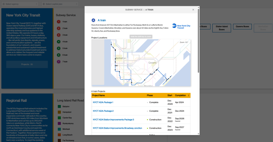
For New York City Transit, we’re also making a fundamental shift by mapping our projects by transit “services” instead of by infrastructure “lines” like our previous Dashboard.
What’s the difference? Infrastructure lines are the physical infrastructure (the set of tracks, tunnels, elevated structures, etc.) that trains run on to traverse the transit system. Most often they are named after the primary surface-level streets that their route follows (e.g. the Lexington Av Line, used by the ), but that isn’t always the case. For example, the Culver Line (used by the and ) is named after Andrew Culver, the founder of the line’s precursor, the Prospect Park and Coney Island Railroad. We use these names internally to refer to specific locations where we’re making improvements, but many of our riders may not always know what they refer to.
Services are the more familiar subway lines identified by letters or numbers (e.g. ). Services can run along multiple infrastructure lines: for example, the runs on the entirety of the Culver Line before heading north along the 6 Av Line in Manhattan, while the only uses the northern portion of the Culver Line before branching off onto the Crosstown Line. Infrastructure lines are agnostic of the services that run on them, and services can change routing based on scheduling, construction, or operational needs.
A good example of this is the upcoming swap. Starting in December, the MTA will “swap” the routing of weekday and service. The will run through the 53 St Tunnel on the Queens Blvd Line and the through the 63 St Tunnel on 63 St Line, the opposite of what they currently do. By shifting the routing, we will be eliminating a major bottleneck in the system, increasing reliability and reducing delays. The underlying infrastructure (the 63 St and Queens Blvd lines) remain fixed; the only thing that changes is the path the trains take.
Because services can and do shift routes on occasion, the data we keep on our assets like track, structures, and signals are not natively tagged with the services they affect, only the names of the infrastructure lines where they are located. Figuring out what services are affected by work on different infrastructure lines isn’t as simple as a 1-to-1 match, either, since multiple services can share the same infrastructure line or use only a fraction of one. Doing work on the Culver Line from Ditmas Av to Bay Pwky doesn’t affect both services that use the Culver Line, only the .
In developing this dashboard, we felt that it would be important for riders to see our projects represented by the things that they know best, so we’ve devised a way to overlay service information onto our infrastructure lines so that we can map projects by the exact services they impact.
In addition to mapping them this way, we’ve also introduced a new tab at the top called “Transit Services” that allows users to see all the projects affecting a particular service. We hope this new functionality will more easily allow users to find the projects that matter to them most.
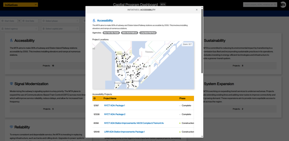
Initiatives
Our new Dashboard also introduces a new tab called “Initiatives” which allows us to group projects by different priority areas like accessibility or resilience. By using this view, users can more easily see our progress on specific efforts, like our commitment to increasing accessibility throughout our transit system.
This new view introduces eight specific initiatives:
- Accessibility
- Resilience
- Sustainability
- Signal Modernization
- Safety
- System Expansion
- Reliability
- Enabled by Congestion Relief
This list is not exhaustive, and we hope to introduce additional initiatives in the future.
Filters
Another improvement is the addition of enhanced filters. These allow you to quickly find projects that will be completed within a certain date range or to narrow results by selecting multiple categories at once—such as project Phase, Geography, Agency, or the Capital Plan(s) projects receive funding from. These multi-select filters are especially useful because many projects span more than one category: a single project can touch multiple boroughs or receive funding from both current and prior capital plans. Multi-select allows you to see the full picture of those overlaps instead of being limited to one category at a time, making it much easier to explore and compare projects across the system. These filters work on the Transit Services and Initiatives tabs as well, allowing you to drill down to very specific queries; for example: finding all Accessibility projects in the Bronx funded by the last Capital Plan that will be completed within the next year.
What’s next
As we said at the top, we’re starting this Dashboard with a limited set of projects to ensure we get the data schema right before we recode our older projects. More projects will become available in future quarterly updates to the Dashboard. See below for our current data roll-out plan:
- On launch: All active ADA projects, Procurement look-ahead, and all candidate locations for the 2025-2029 Capital Plan.
- Q4 2025 Update: Updated data from previous release plus all third-party C&D managed construction projects awarded in 2025.
- Q1 2026 Update: Updated data from previous releases plus all Rolling Stock projects.
- Q2 2026: Updated data from previous releases plus new in-house construction projects.
- Future updates: All awarded projects.
This Dashboard is a work in progress, and we’ll keep building and incorporating feedback as we receive it. Our goal is to make it a useful tool for tracking our progress on delivering projects and for showing where investments are being made across the system. Let us know what you think!