The MTA Data & Analytics team publishes over 230 data assets about the way millions of customers move through the tri-state area: everything from congestion pricing entries, to bus wait times, to customer survey results. Some of our datasets have billions of rows, some have intricate geospatial information, and some have internal jargon that makes it inscrutable to all but experts.
Since the enactment of the MTA Open Data Law in 2021, the MTA formalized a program to publish that data in open, machine-readable formats on the New York State portal. So, in addition to making datasets available on the portal, our Open Data team has gone beyond the letter of the law to help our customers understand our data. In 2022, we launched a user-friendly website, metrics.mta.info, designed to present a significant subset of MTA data in a format that’s accessible and understandable to non-technical folks.
Our datasets and metrics site every year are accessed by thousands of users a year. But ultimately, we have little observability into how people use MTA data tools, and what data they’re interested in.
We on the MTA Open Data team set out to change that.
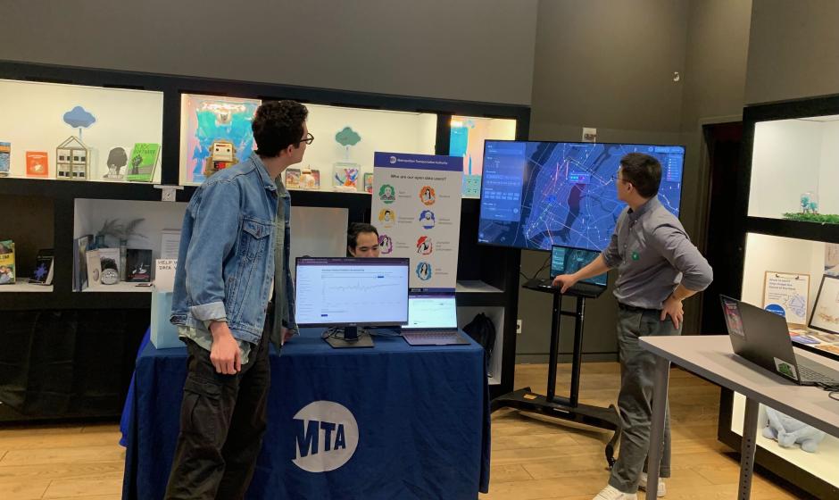
We hosted office hours bookending NYC's Open Data Week for everyone from policymakers to curious customers to drop in and give us feedback. With the gracious support of CUNY’s PIT Lab at the Oculus, managed by Anthoni Garcia, we hosted over a hundred visitors to discuss everything from bus runtimes to subway air quality. Over the time we spent there, we learned a lot about what people want.
Building a system for multiple user types is a challenge
Our metrics site was originally designed to provide an interactive version of the information published in our MTA board books (like from our team’s presentation at the March 2026 meeting!).
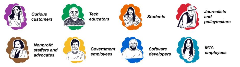
But we know all too well that our board members aren’t the only folks who care about MTA data—far from it. In fact, we often frame our discussions around a set of eight user stories to guide the features that we build and data we publish.
Take Jamaica on-time performance for the Long Island Rail Road as an example. LIRR policymakers may care a lot about the systemwide average for this number. Tech educators may want to give a data lesson by showing how LIRR delay data can be “rolled up” to figure out which trains are the best performers—and worst offenders. Journalists may want to see how a bridge rehabilitation or snowstorm affects MTA service patterns.
One website for all these different use-cases? It sounds nice, but it’s also clear our existing metrics site has pain points for everyone these days.
We on the Open Data team are committed to ensuring that the state portal isn’t the only place people can use MTA data. After all, the external metrics site has proved indispensable to many of our stakeholders—college students, good-government advocates, Albany policymakers, and more.
So as we refine and rebuild our external data tools, we’re thinking carefully about that line between what our non-technical users need to understand our data, versus what we might know our more technical stakeholders can do themselves in Excel, a PowerBI or their favorite GIS software.
People may not think in system terms…
After all, why should they? Most New Yorkers aren’t completing a subway challenge—they’re commuting to work and school, visiting their families or running errands. Bus wait assessment is an important metric for our team and bus operators to pay attention to, but folks told us they care much more about how frequently their bus runs, during rush hour and near their stop, than how frequently buses run in general.
For example, a group of CUNY students used our data on Automated Camera Enforcement to demonstrate how the program would speed up their commutes to and from school. Subway Stories used our ridership data to illustrate the patterns of movement and life in the city. And journalists at Bloomberg used our archived realtime data to help their readers understand how often LIRR and Metro-North commutes are disrupted.
In the journalism world, there’s an old adage that all news is local. The same can be true for our data—so as we build out new tools, we’re going to be especially focused on making things that help our riders explore transit in the places they care about most.
… or wonder about the bureaucracy, either
Though the MTA was created by the State of New York in 1965 to unify transportation services in the NYC area, transit service is still influenced by many other government agencies in ways that might not be obvious to the average New Yorker.
Here are a few non-exhaustive examples:
- Bus stop and bus lane infrastructure, used by MTA buses, are built and maintained by the NYC Department of Transportation, which is not a part of the MTA.
- However, the MTA sets the location for those bus stops in conjunction with DOT and other agencies, like in the recently-completed Queens Bus Network Redesign.
- Most land around NYC subway tracks is not owned by the MTA, but by New York City itself.
- JFK and LaGuardia airports are owned by the City, but leased to the Port Authority of New York and New Jersey, so programs like the free Q70-SBS must be coordinated closely with both organizations.
It’s complicated. And that complexity is mirrored in how complex it can be to give a good, data-informed answer to a tough data question. Sometimes, an answer that’s accurate or actionable might require combining, cleaning and inspecting several different datasets that are owned by multiple different agencies.
Ultimately, when our users have a question about transportation, they expect the MTA to have the answer, and we’d like to be able to give it to them—even if it’s not found in our data. As such, we’re really interested in publishing tools that incorporate data from partner agencies like NYCDOT, Port Authority, and more.
Of course, we know our MTA data best. But we’re always excited to keep collaborating with our colleagues at other organizations to make sure that MTA stakeholders can get good, relevant answers to their questions.
New Yorkers understand maps instinctively
We on the MTA Open Data team were amazed with just how much folks loved the maps we shared with them—not just as ways to play with data, but also as vital visual aids.
For instance, we had a visitor in the middle of our time at the Oculus begin discussing issues she had with the M9 bus. As we spoke, it felt like we were talking past each other, but pulling up the beta version of BusTime, and showing her the new map feature changed the dynamic of the conversation immediately.
“Yes! Oh my gosh,” she said. “Can you zoom in for me?”
As we rushed over to the computer, she put her finger on the screen.
“There! Now my son goes to school there,” and moving her finger an inch, she said, “and that’s where we normally get on.”
Maps are great ways to give people a common language. They represent the world—especially corners of it as complex and messy as New York—in ways that are quickly parsable and intrinsically linked to our physical environment. Like our friend on the M9, the right visualization can unlock so much information that wouldn’t be possible otherwise. So we’re thrilled to look at just how we can use our mappable data to enable more experiences like that.
Some data we just don’t have
At the pop-up, we got about 40 requests for new datasets. Some of those data we do have and publish on a regular basis, some we have and are in the process of publishing. But some data we just don’t have.
For instance, one of our most common requests from the pop-up was for datasets on crowding, both in stations and on subway cars. LIRR and Metro-North both have handy diagrams that demonstrate how busy each car is, helping weary commuters nab a solo seat.
Why don’t we have this for the subway? The short answer is that most cars on our railroads have technology that weighs the cars as they roll towards their destination, and this weight serves as a proxy to show how crowded each car is. Subway cars don’t have the same technology. There could be other ways to publish that data someday, but for now, it just doesn’t exist.
There are a lot of stories like that, so moving forward, we’re going to be particularly interested in how we connect folks with the best data we do have, as well as gathering and publishing new datasets that can help users explore more of their questions.
What’s next?
We’re working on a full redesign of our metrics.mta.info website, taking into account all of the feedback we’ve gathered about what folks want to see. And, we have a full roadmap of open datasets we hope to publish in the coming months.
Have feedback? Want to see a new open dataset? Send us an email at opendata@mtahq.org.
Nick DeMarchis is a data engineer on MTA’s Data & Analytics team who specializes in visualization: building products to make the MTA’s data accessible and legible.